Creating Art
 Wednesday, August 12, 2009 at 8:15PM
 Interpreting and appreciating art is a personal experience. What one person may love, another may dislike, or "not get". When I post my pictures on the flickr website, I get immediate feedback and it allows me to ponder what others might see in the pictures. While I only post pictures that I think have some merit, sometimes the reaction is out of synch with my own opinion of the shot.
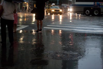
Here's what I'm reacting to... last week in a poring rain storm I parked myself underneath a building portico and took a lot of pictures of wet people. Since it was dark, I used a high ISO, this meant that the pictures would be brighter but also grainier. Here is the picture that I started working with. Not a great picture, but with some post-processing, it looked to have some potential.
 The main appeal to me in the composition was the positioning of the cab turning onto Park Row. So, I cropped it and straightened it. It was OK, but nothing special to me. So, I started playing around with some of the values in Lightroom, a tool I use to manage my photo library. I finally settled on posting this version of the picture.
 I thought it was good, and fairly interesting, but those on flickr responded in a way that was out of synch with how I saw the picture. They made it by marking it with the most "favorites" of any picture I have ever put up there, and in the shortest amount of time. As a matter of fact, when I saw it online, I wasn't completely happy with it. I was going to replace it with a version that I had worked with before posting it, which was this one.
 I do think this one is the best, but I won't replace it since people liked the other one so much. In any case, it is ultimately a creation of art, using only the building blocks of what was there. And, I'm quite happy with that result.
In the end though, while I think it's a very good picture, I do not think it is great. (There are others I've taken that I think are great which have barely gotten a reaction). But that's just what I think, and what do I know, I'm only one person.
 For the finest StreetObservation photos available for sale, click here.


Reader Comments (2)
Hi John, I'm a bit late, but still..
The reason why people prefer a picture than other one has to do with the "golden section" ( http://en.wikipedia.org/wiki/Golden_ratio). If a picture has elements or objects in the golden sections, probably people will like it more. In this picture (the second and third), it seems that the cab is reaching the golden section by the right side and the woman in the left side.
For me (now my imagination!), the picture shows the woman loneliness. She is alone and the traffic comes toward her. It is dark and there is danger. The cab driver saw her and went to another direction, but how about the other drivers? Will they see her? She looks fragile in those shoes. It seems there is more danger in the second picture than in the third one (because there is less light).
Hi John, I think that the second picture is more intriguing than the third because the post processing gives here a special atmosphere. As someone else has commented on flickr, it reminds me a movie scene maybe from the '70.